
Mishaal Rahman / Android Authority
TL;DR
- The Android Settings app could get a major design overhaul in an upcoming Android release.
- The new design could bring Material Design 3 switches, have each item in separate cards, and use carets to indicate when subpages exist.
- The new version of the Settings app isn’t live yet in Android 16 Beta 3, and we don’t know when it’ll arrive.
The Settings app is one of the most important apps on any Android device, so it’s crucial that vendors make it as easy as possible to navigate. To make it easier to deal with the sheer number of menus and toggles in the Settings app, Google has spent the past few months working on a totally new Settings design that provides a clearer visual separation between settings and also makes it more obvious when a settings entry has an additional subpage. Here’s a first look at the new Settings design that Google is testing in Android 16.
You’re reading an Authority Insights story. Discover Authority Insights for more exclusive reports, app teardowns, leaks, and in-depth tech coverage you won’t find anywhere else.
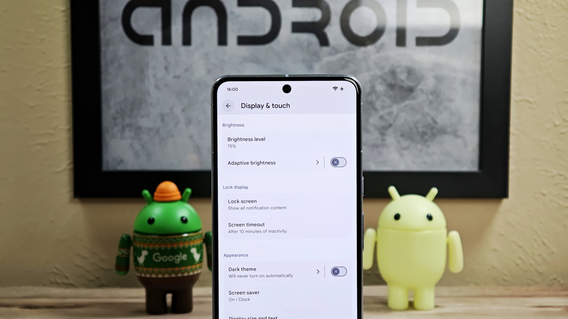
While I was looking through Android 16 Beta 3, I spotted signs that Google is working on a more “expressive” design for the Settings app. With a bit of effort, I managed to fully enable the new “expressive” Settings design. Here are some images that show various parts of Settings with this new “expressive” design.
And for comparison, here are the same pages in the Settings app from Android 15.
There are four main differences between the old design in Android 15 and the new, “expressive” design that Google is testing in Android 16 Beta 3. First, the new design features newer Material You switches with an X or checkmark icon in the handle. Second, each item in Settings is now placed in separate, visually distinct cards. Third, small arrow icons, or carets, are now used to indicate when an item in Settings has a subpage. Finally, most pages now feature the header at the very top by default. This allows for more items to be shown at first glance, as demonstrated by the developer options page in the images shown above.
Although I spotted this new “expressive” design in Android 16 Beta 3, I don’t think it’ll roll out in the upcoming Android 16 stable release. Instead, I think it’ll roll out in one of the upcoming quarterly releases of Android 16, if not next year’s Android 17 update. That’s assuming that Google doesn’t scrap this design entirely, however. I hope that Google moves forward with this design, as it makes the Settings app much easier to navigate in my opinion. What do you think of this new design for the Settings app?